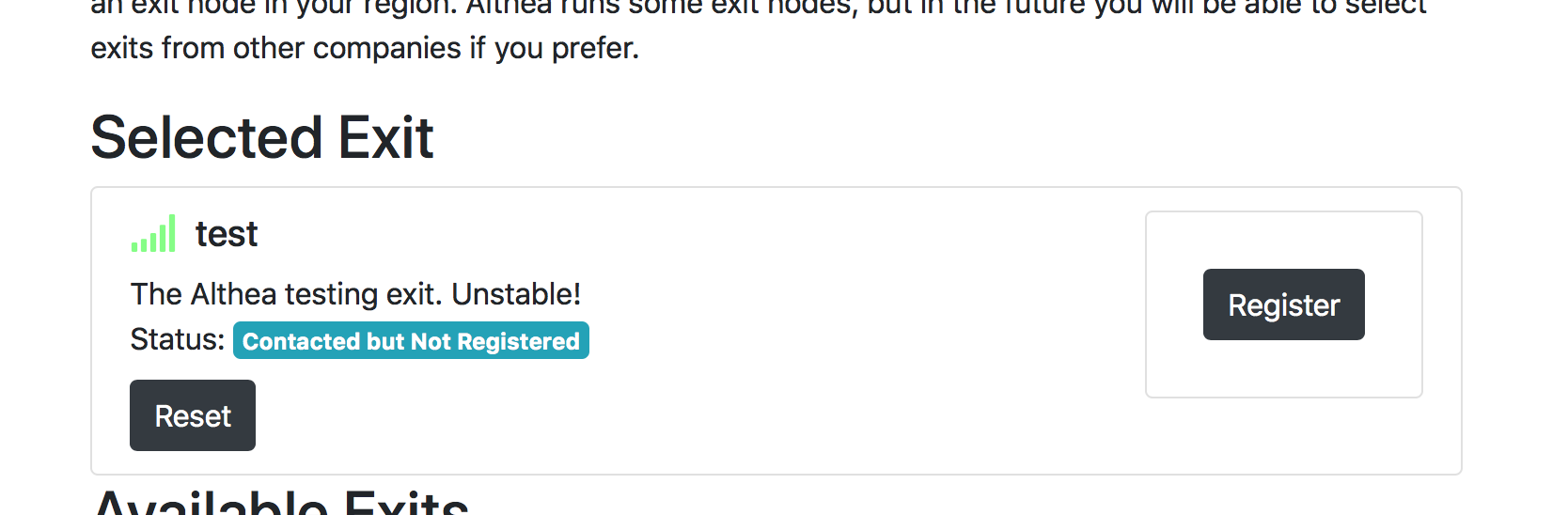
As a user, I see the green bars which seems good, and the fact that the exit is “selected” and I feel that the exit should be working. But then I see the register button and I think it must not be.
Possible solutions would be to
Use the green bars to signify “connected” instead of reachable. Sort the list to place reachable exits at the top, and set unreachable exits to 10% opacity
Do not “select” exits that are not registered. If there is some backend reason to always have a selected exit, just don’t show it in the selected slot if it is not registered.
@Adam_Soltys I will post a wireframe of the new design in here
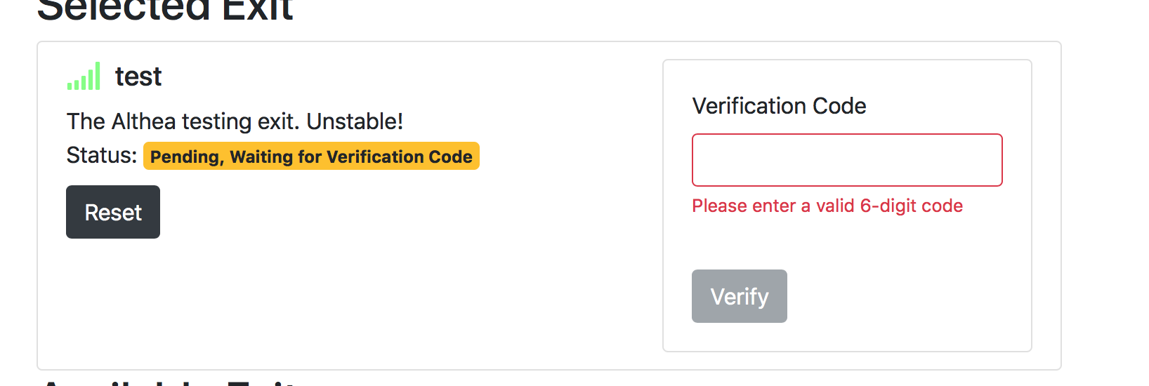
After submitting an email, the first thing that I see is the red validation failure. This will be fixed in the issue above, but I also think that there’s a lack of explanation about what is happening.
@Adam_Soltys I’ll let you know when I have wireframes for a better version
First of all, the progress bar should probably go away. Second of all, we should rewrite the error message. @Adam_Soltys ping me to brainstorm on that.
Apparently it is reachable. I think this state means nothing to the user. Maybe it’s just a matter of rewriting the status? @ttk2 ping me about this so that I can refresh my memory on what this state means.
this means you have an exit configured and can talk to it but it never talked back to you.
for gateways exits are neighbors if you just look at the tunnels, there’s enough info around to filter them but from a question of ‘what software is being run’ peer and exit tunnels are the same.
That’s a good point, I still think that it is confusing to the user since they will be expecting the neighbors screen to show physical neighbors. We may want to consider a gateway-specific exit interface in the future. For now, I’m guessing we can just filter them out pretty easily right?
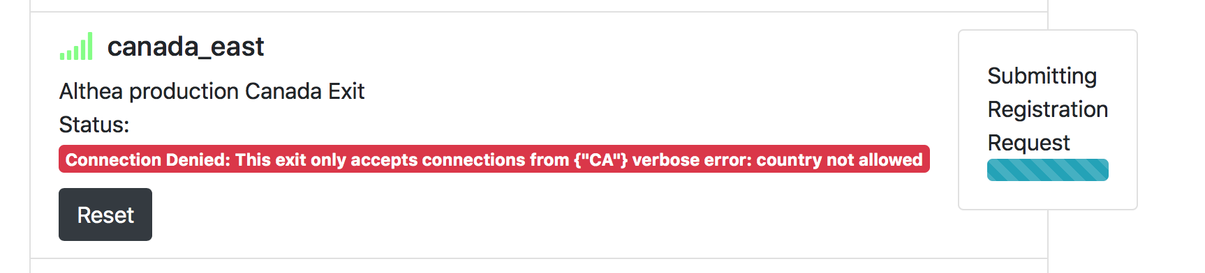
Seeing this for the first time didn’t really confuse me much. However, it might make more sense as yellow prior to registration.
Personally, the entire “submitting registration request” isn’t needed once the error message comes back as denied. As a user, this message is kind of annoying since everything prior to registration was acting like I could register and then it region locks. Not sure how difficult it would be to know these are region locked before registering.
The techy in me loves this. The user in me had no clue what it was other then exit nodes. The tester in me probably needs it and while I love that one of my neighbors ipv6 is “leet elf” it might need other names.
@Adam_Soltys one other note, when an exit goes into ‘registered’ it start’s checking it’s tunnel state, but it shouldn’t do that for any one but the selected one.
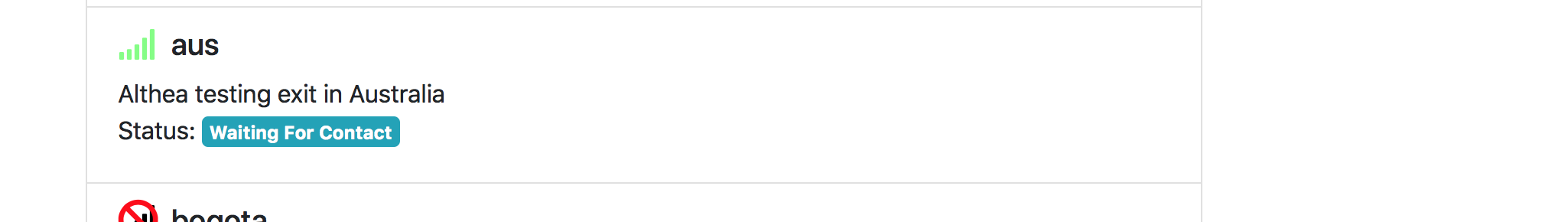
That’s a good point. I’ve forgotten all the exit listing state machine states, but IMO once the exit has been contacted (GotInfo?), there’s no reason we shouldn’t be able to display whether or not the region is OK. I believe this would be somewhat involved to implement though so we can just put it in the backlog for now since it is not a critical feature.